
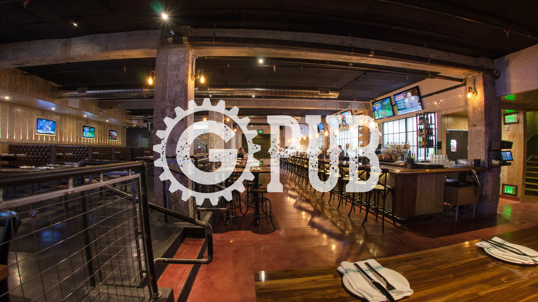
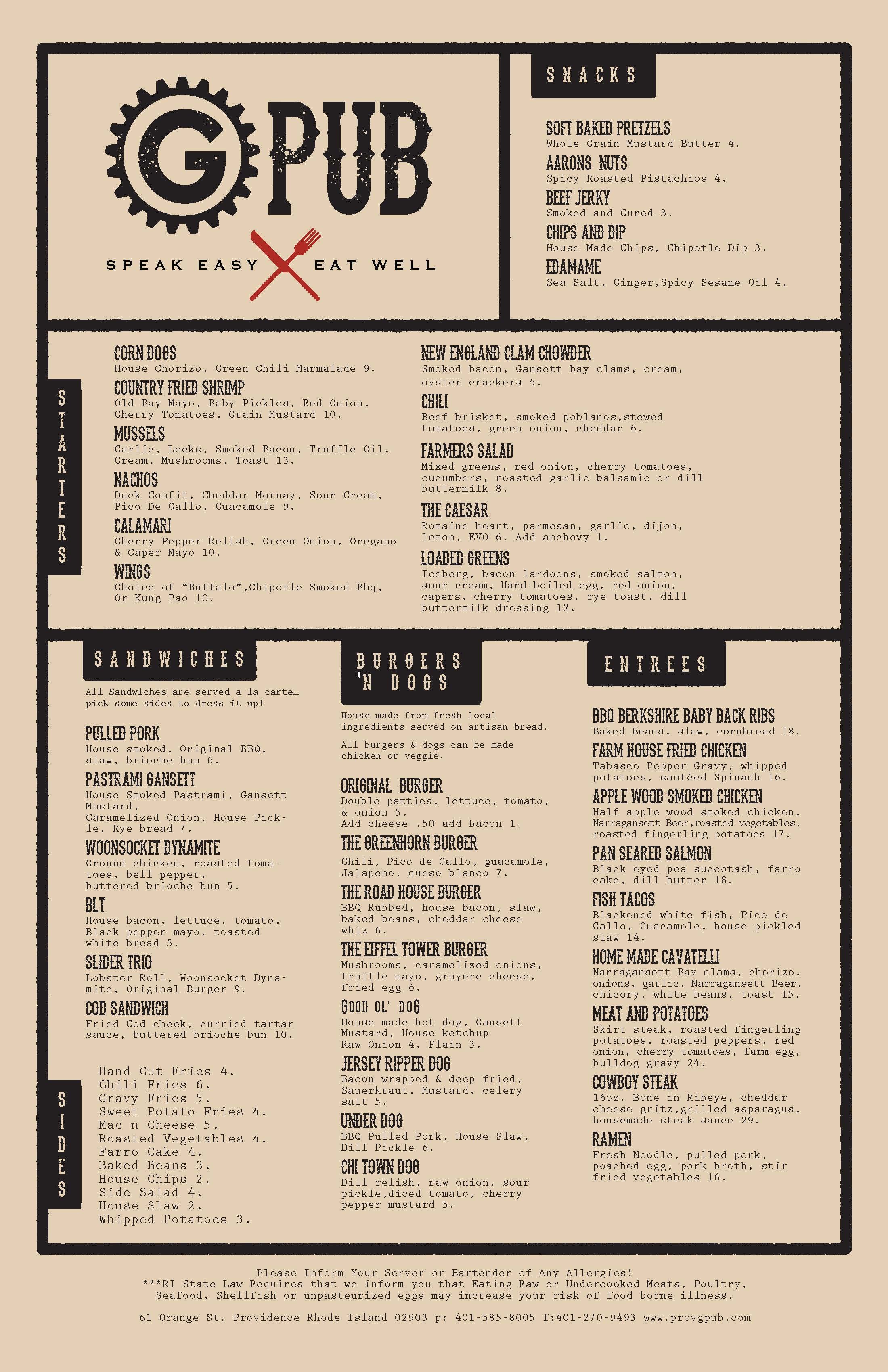
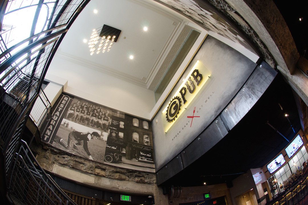
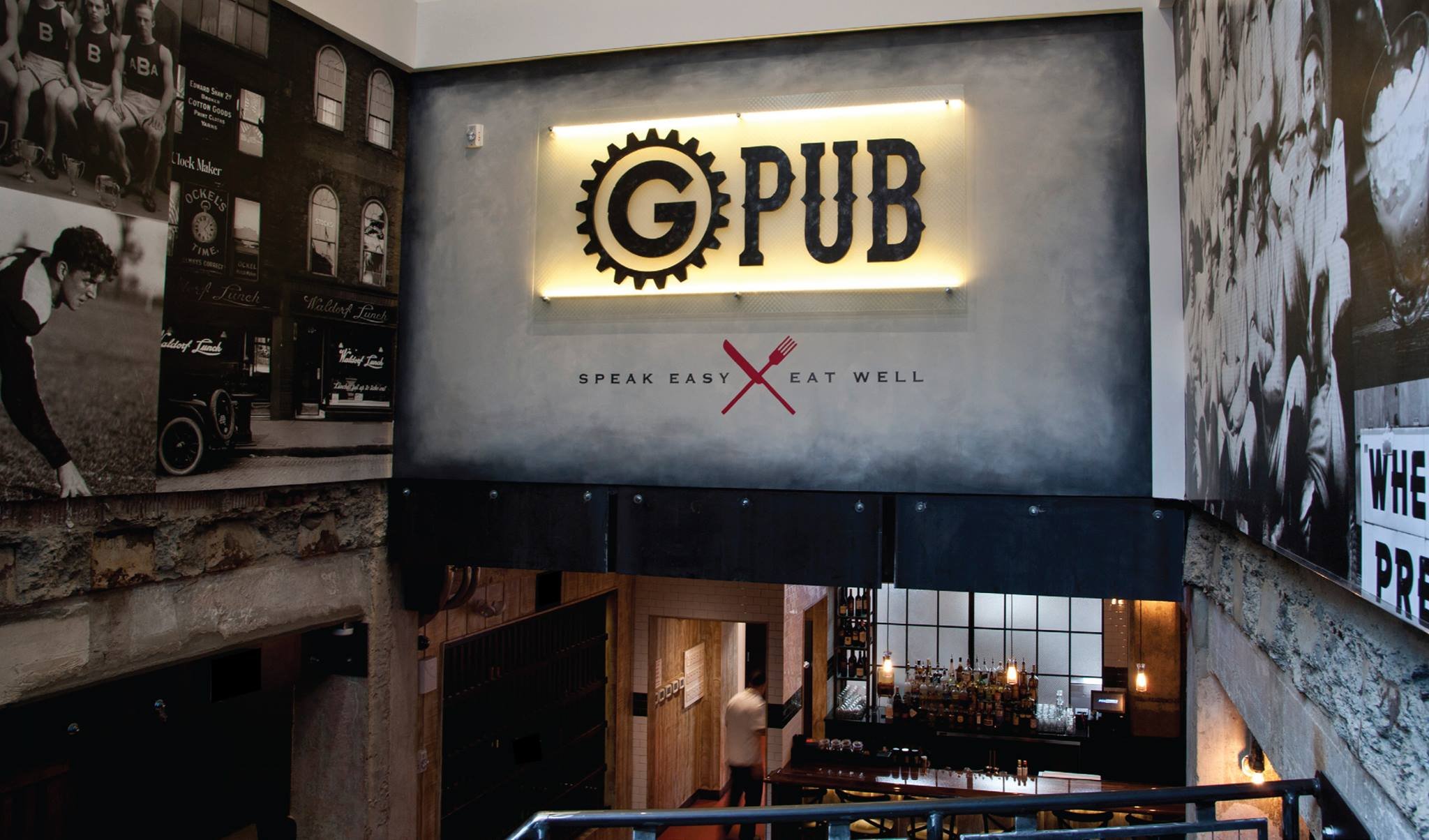
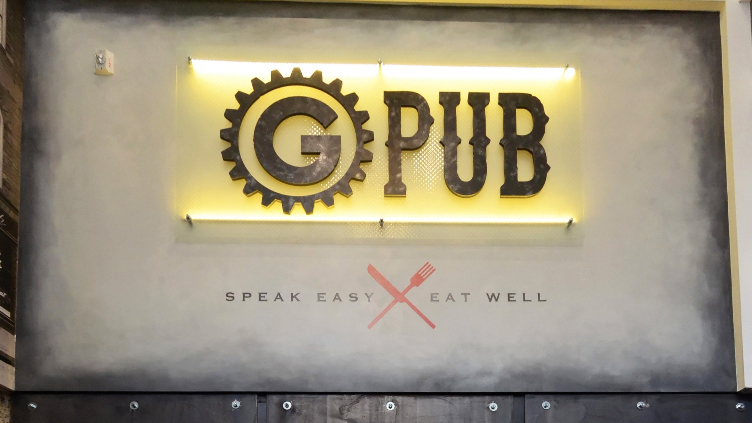
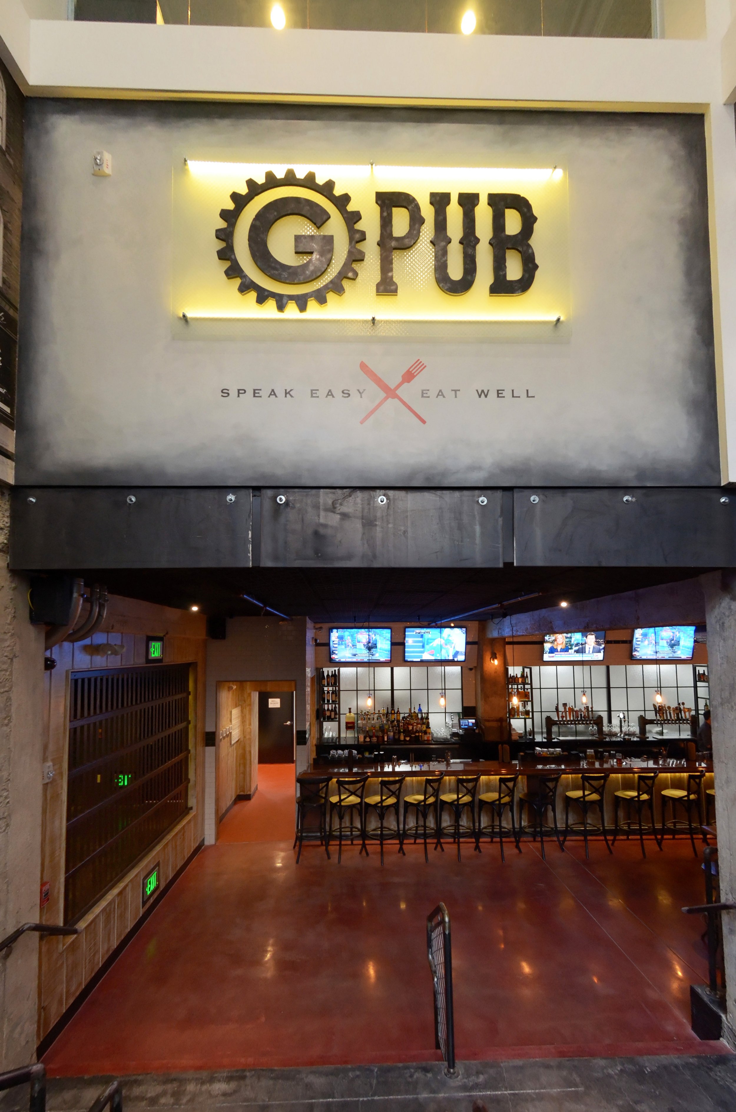
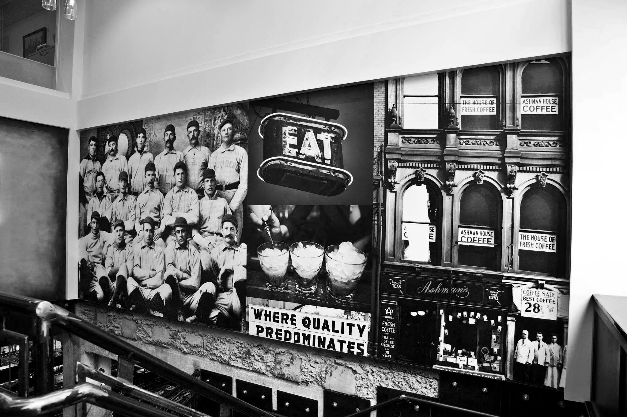
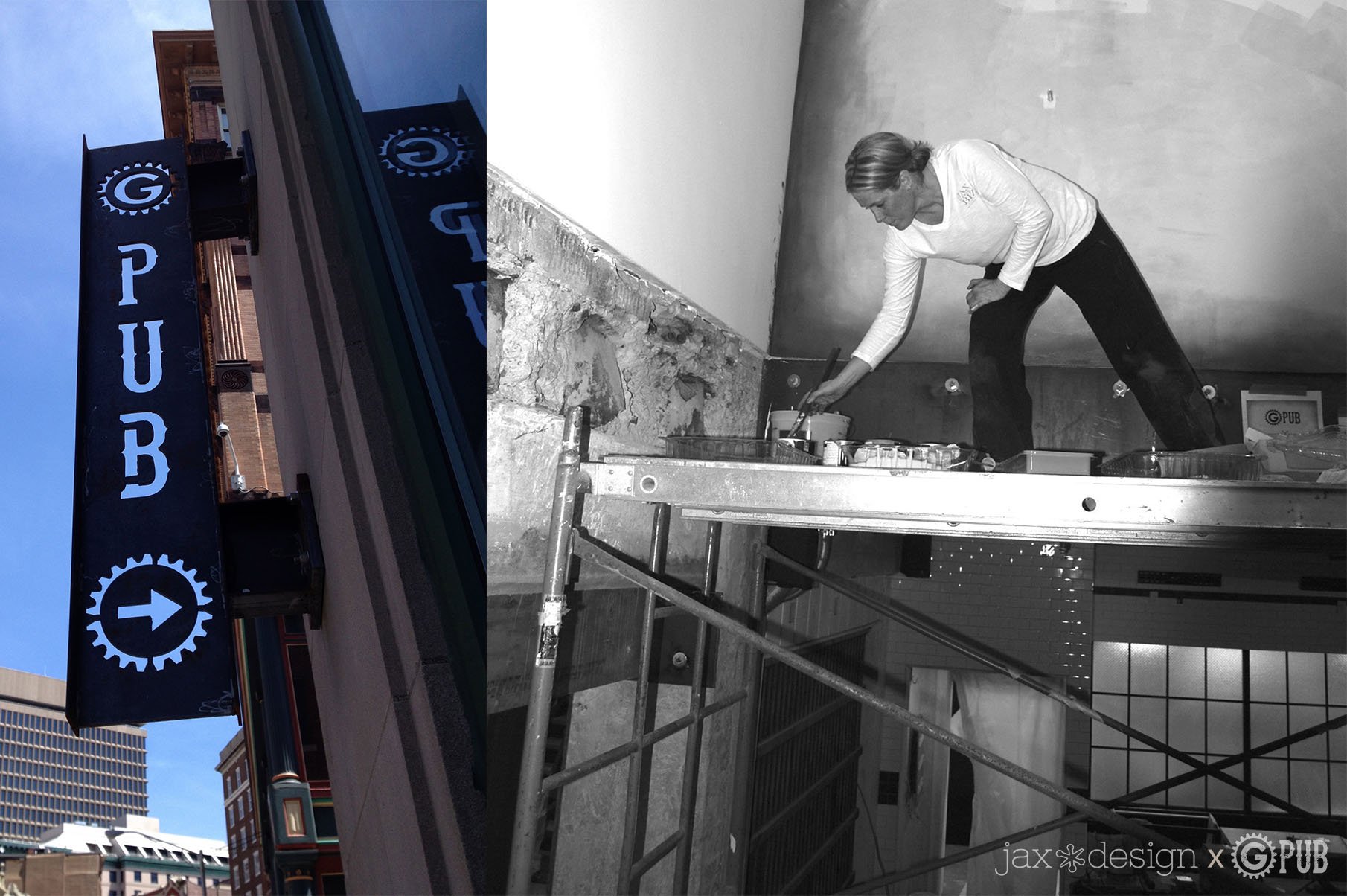
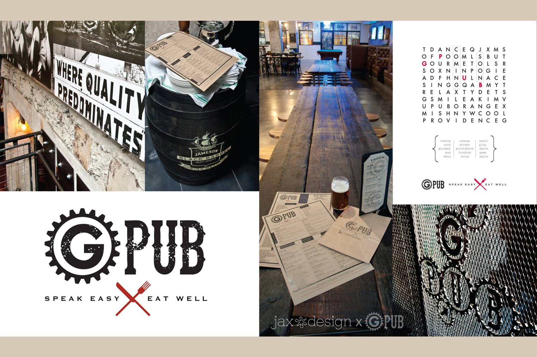
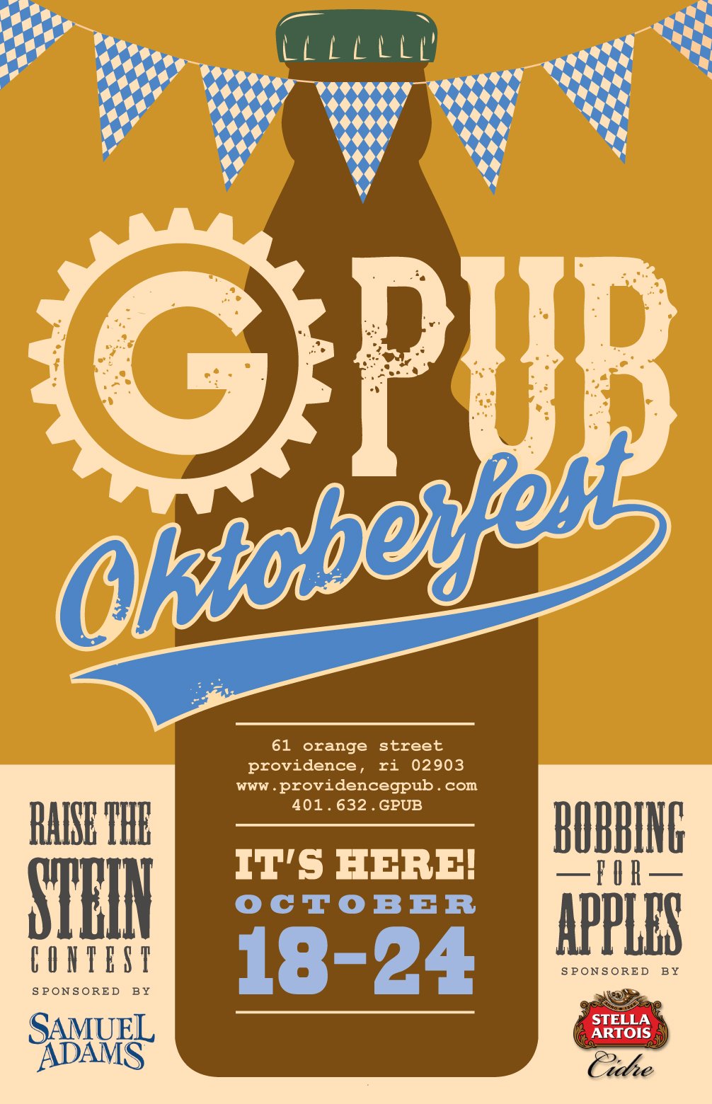

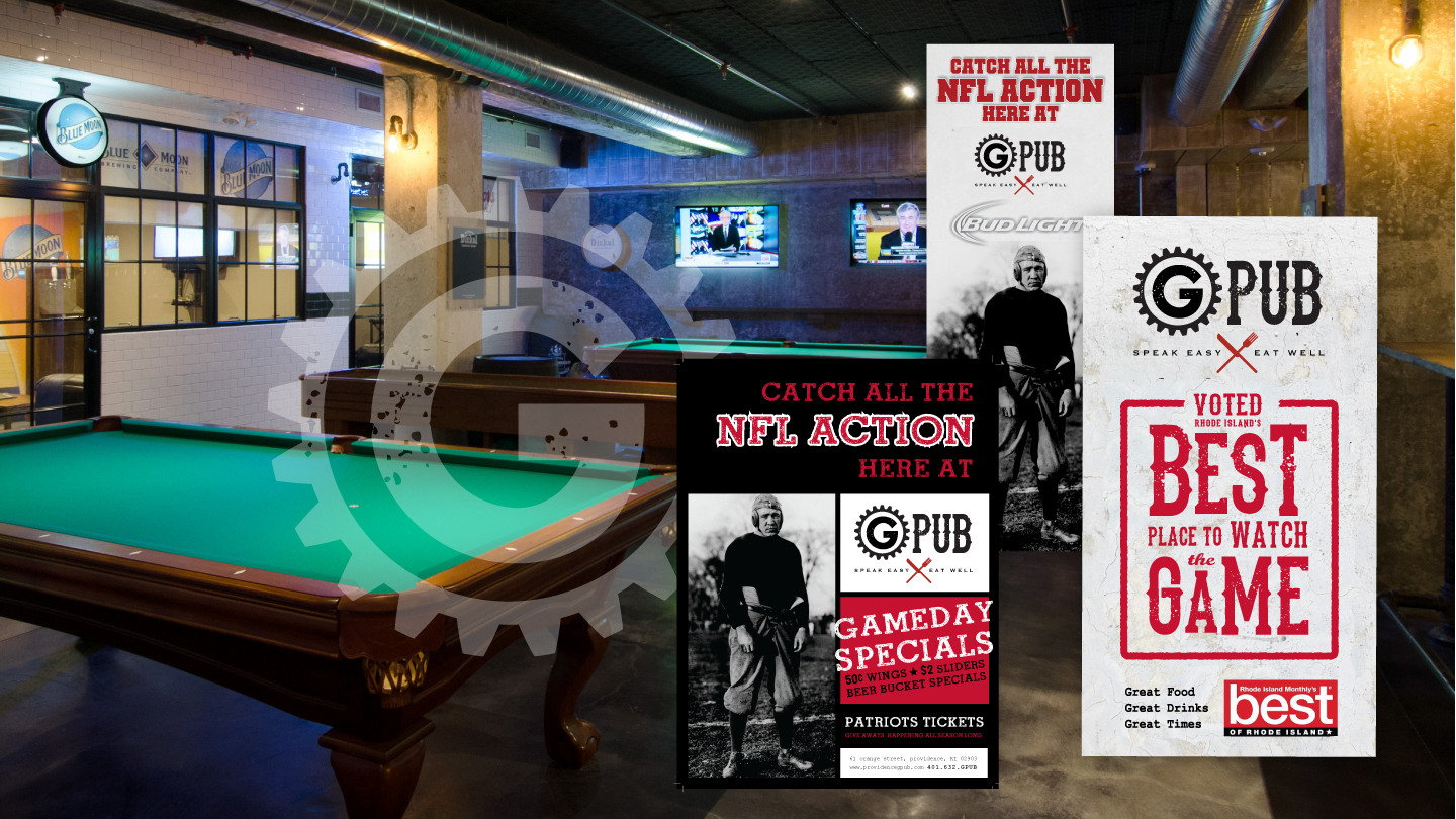
Embracing the darkness and raw materials of the space was the first step in creating the logo, one reminiscent of a time gone by and yet simple enough to retain its relevance to today’s desire for a modern gastro pub. As for the entry, dense historic imagery includes phrases like ”where quality predominates,” immersing patrons in a time of simpler priorities and good old fun. These elements render the large space more intimate, inspire curiosity and celebrate Providence’s history as one literally descends into it. The warmth of the wood is welcoming and familiar, and those qualities are echoed in the use of craft paper for the menu series whereas the use of black as a complimenting color, represents the steel structural and environmental elements that make the space unique.
